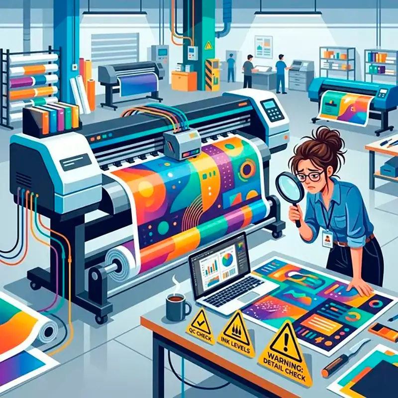
Wide-format banner printing has its own specifics that differ significantly from printing standard business cards or flyers. We've compiled the 10 most common mistakes that can ruin the final product, along with tips on how to avoid them.
1. Low Resolution
❌ Mistake: Using photos saved from the internet (72 dpi) and stretching them over the entire banner.
✅ Solution: For banners viewed closely, use 150-300 dpi. For large banners (on building facades), 36-72 dpi at a 1:1 scale is sufficient, but the source image must be high quality.
2. RGB Color Mode instead of CMYK
❌ Mistake: Sending the layout in screen color mode, causing bright colors to become dull when printed.
✅ Solution: Always convert your layout to the CMYK color space.
3. No Safe Margin for Eyelets
❌ Mistake: Text or logos are too close to the edge. When punching eyelets, the hole goes right through important information.
✅ Solution: Leave a "dead zone" of at least 4-5 cm from each edge without text and important elements.
4. Incorrect Layout Size
❌ Mistake: The layout is not made in proportion, leading to deformation or unwanted cropping.
✅ Solution: Always create the workspace in real dimensions (1:1 scale) or clearly specify the scale (e.g., 1:10) when sending the file.
5. Text Overload
❌ Mistake: The banner looks like a book page. Drivers or passers-by have only a few seconds to perceive the message.
✅ Solution: 3-second rule: logo, main offer, and large contact info (phone or website).
6. Thin Lines and Small Fonts
❌ Mistake: Using thin serif fonts that are impossible to read from a distance.
✅ Solution: Use simple sans-serif fonts in a large size.
7. Fonts Not Converted to Outlines
❌ Mistake: The print shop opens the file, and your unique corporate font changes to a standard Arial.
✅ Solution: Always convert all texts to outlines/curves before saving the final file.
8. Solid Black on Large Areas
❌ Mistake: Background color set to C:0 M:0 Y:0 K:100. On the banner, it will look like dark gray with possible banding.
✅ Solution: For a deep rich black background, use the formula C:50 M:40 Y:40 K:100. For small black text — always use just K:100.
9. No Bleeds Left
❌ Mistake: The background ends exactly on the cut line, which can cause white stripes around the edges.
✅ Solution: If the banner is cut exactly to the edge without hemming, add 2-3 mm of bleed.
10. Saving in the Wrong Format
❌ Mistake: Sending files in Word, Excel format, or native formats of incompatible editor versions.
✅ Solution: The best format for wide-format printing is TIFF (with LZW compression) with flattened layers or PDF/X-1a.
Not sure about your layout?
Send it to us — our prepress specialists will check your file for free!
Write to us on Telegram →